July 18, 2025
Intermediate
Is Tailwind Mobile First? Come Find Out with Me.
As a young adventurer in this world of frontend, I want to share with you a lesson I learned a while back.
While developing the layout of my blog with TailwindCSS, I came across something I hadn't known until then: Tailwind follows a mobile-first approach. This made all the difference in the way I started structuring my components and styles.
And that's what we're going to talk about in today's article! So grab your coffee, tea, or water and come with me on this little knowledge expedition through the world of Tailwind.
What is TailwindCSS?
Before explaining how I discovered that TailwindCSS adopts the mobile-first concept by default, I need to give a bit of context about the tool.
Tailwind is a utility-first CSS framework that lets you style web pages using classes directly in the HTML. What does that mean?
Think of it this way: instead of writing styles in a separate file, as is done in CSS, you style the elements directly in the tag, using ready-made classes.
Let's look at an example:
Using CSS to style a button, it would be something like:
<button class="login-button">Login</button>
.login-button {
  background-color: #3b82f6;
  color: white;
  padding: 0.5rem 1rem;
  font-weight: bold;
  border: none;
  border-radius: 0.25rem;
}

.login-button:hover {
  background-color: #1e40af;
}
But how would this same styling look in Tailwind?
<button
  class="bg-blue-500 text-white font-bold py-2 px-4 border-none rounded hover:bg-blue-800"
>
  Login
</button>
Notice that the main difference lies in how we apply the styles. With TailwindCSS, we insert the classes directly into the HTML tag, which makes the process more direct and integrated. With traditional CSS, on the other hand, we need to create a separate file to define the styles and then link it to the HTML.
In the end, the result is the same.

An image of a blue button with the word login written inside it
With Tailwind, it's easier to style the element. This makes interface development much more agile and productive. On top of that, it encourages building modern, responsive layouts.
What is Mobile First?
Now that we understand TailwindCSS better, it's important to talk about an essential concept in frontend: mobile-first.
It's a development approach that starts out geared toward smaller screens, like smartphones. From there, the layout is gradually adapted for larger devices (such as tablets and desktops), using breakpoints, which are points defined in CSS to apply style changes as the screen width increases.
This approach ensures that the mobile experience (usually more limited in terms of space) is prioritized from the start, avoiding rework and promoting a smoother adaptation to other screen sizes.
In Tailwind, this happens by default, that is, natively. The styles applied outside of any breakpoint are interpreted as mobile, and breakpoints are used only to adapt the layout to larger resolutions.
How did I discover that TailwindCSS followed this mobile-first approach?
While developing the blog's frontend, I ended up facing the scenario of making the main page (the famous homepage) responsive. However, the page was breaking both on smaller devices and on larger screens.
I spent two to three days trying to understand what was going on. I reviewed the code, tested different class combinations, and even considered going back to good old plain CSS (lol). But before giving up, I decided to take another look at the code, calmly this time. And then, a question came up: could it be that Tailwind follows a mobile-first approach by default?
I went straight to the documentation (a valuable reminder of how essential it is), and there it was: TailwindCSS uses a breakpoint system based on mobile-first, that is, styles defined without any breakpoint prefix are applied to smaller screens, and for larger screens we add (sm, md:, lg:, and xl:).
An interesting fact is that the documentation itself cites Bootstrap as a reference, which popularized this concept a few years ago.
For those just starting out, it's worth remembering that Bootstrap was, for a long time, the great ally of devs who wanted to create fast and responsive layouts, especially those who didn't have much affinity with CSS.
I recommend reading: Tailwind Documentation: Responsive Design
This discovery helped me understand where the error in my code was and how to adjust the responsiveness in the project.
How does this work in TailwindCSS?
In short, in TailwindCSS, all classes applied without breakpoint prefixes (sm:, md:, lg:, xl:) are interpreted as the default styles for mobile devices. That's what characterizes the framework's mobile-first behavior.
When we use the breakpoint prefixes, we're telling Tailwind: "from this point on, apply this style", that is, the style is progressively adapted for larger screens, according to the defined breakpoints.
Example:
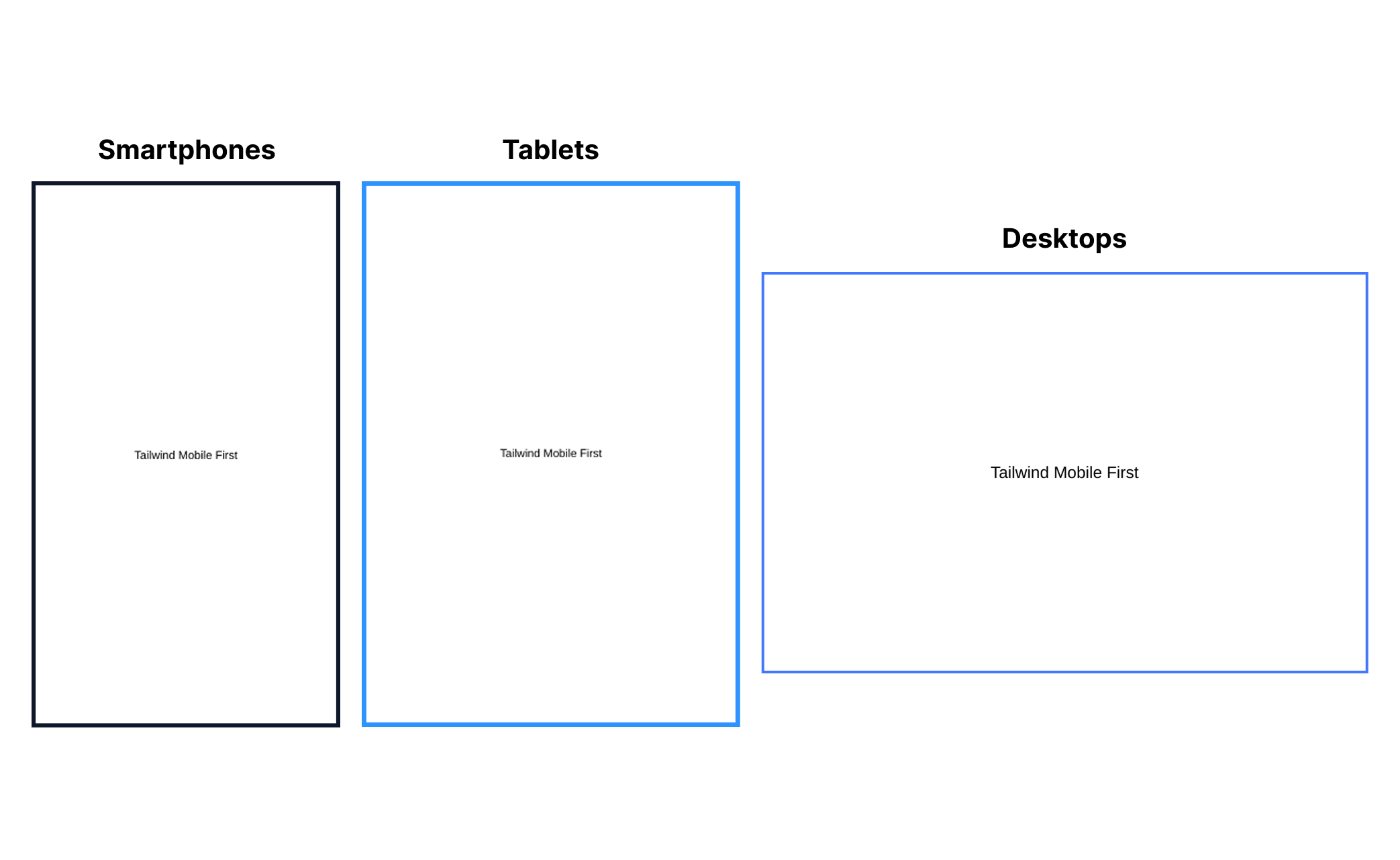
<div class="text-sm md:text-base lg:text-lg">
  <p>Tailwind Mobile First</p>
</div>
What happens in this example is that, on smaller screens (mobile), the text will be displayed at the text-sm size (roughly 14px). For a medium size starting at 768px wide (medium screen), Tailwind applies text-base (16px). And finally, for larger screens starting at 1024px (large screens), the text switches to text-lg (18px).
A very important point: in the TailwindCSS documentation itself, it's emphasized that you don't need to use the sm: prefix to style elements on mobile devices. That's because, by default, styles are applied to smaller screens, that is, mobile comes first.
In addition, Tailwind stresses that we shouldn't interpret sm: as "small screens," but rather as a small breakpoint. This means that when using sm:, you're defining styles that will be applied starting from that width point (usually 640px) and not only on small screens.
Example from the documentation itself:
❌ Don't use sm: for mobile devices.
<div class="sm:text-center"></div>
This will center the text only on screens 640px or larger, and not on small screens.
✅ Use no prefix for mobile devices and override at larger breakpoints.
<div class="text-center sm:text-left"></div>
This will center the text on mobile devices and align it to the left when the screen size is 640px or larger.
This kind of approach makes creating responsive interfaces much easier, and the official Tailwind documentation does a great job explaining every detail. If you're getting started with the framework or want to go deeper, it's well worth consulting; it's clear, well structured, and an excellent source of continuous learning.
Link to access the documentation: TailwindCSS
Conclusion
TailwindCSS is, without a doubt, a powerful tool that does a great job of boosting productivity in interface development. I believe tools like this offer an amazing path for those seeking agility in front-end.
At the same time, it's important to find balance in how you use it. Just as it has plenty of advantages, Tailwind also presents challenges, especially when it comes to maintenance or an excess of classes in the HTML. That's why understanding in depth how it works makes all the difference.
See you in the next article 💙
Onward, always! 😊🚀
Post Author

Leticia Dias
Sou desenvolvedora full stack com foco atual em frontend e, nos últimos tempos, me aventurando no universo do design de interfaces. Já atuei como instrutora no curso técnico de informática, onde tive a missão de preparar alunos para o mercado de trabalho. Além do código, sou apaixonada por filmes, séries, animes e tenho um lugar especial no coração para o k-pop.